Data visualisation in R

Age-standardized DALYs rate of cardiovascular disease per 100,000 population from 2001 to 2021 in South Asia by country’s GDP/capita (US$)
The GDP per capita (inflation-adjusted) are plotted in x-axis and corresponding values of age-standardized cardiovascular disease (CVD) rates for A) Females and B) Males are plotted in y-axis. The size of bubble corresponds to the size of the population of the country. The definition of cardiovascular disease includes all eleven CVD types and is described elsewhere. The data on cardiovascular disease rates were obtained from the Global Burden of Disease and GDP per capita from World Bank.
Plotting graph
Code
p <- ggplot(
dat1,
aes(x = income, y=val, size = Population, colour = Country)
) +
geom_point(show.legend = TRUE, alpha = 1) +
scale_color_viridis_d() +
scale_size(range = c(2, 12)) +
scale_x_log10() +
labs(x = "Income per person (GDP/capita PPPS inflation-adjusted)", y = "Age-standardized DALYs rate per 100,000") +
  facet_wrap(~sex)


R <- p + transition_time(year) +
labs(title = "Year: {frame_time}") +
shadow_mark(alpha = 2, size = 2) +
  facet_wrap(~sex)
R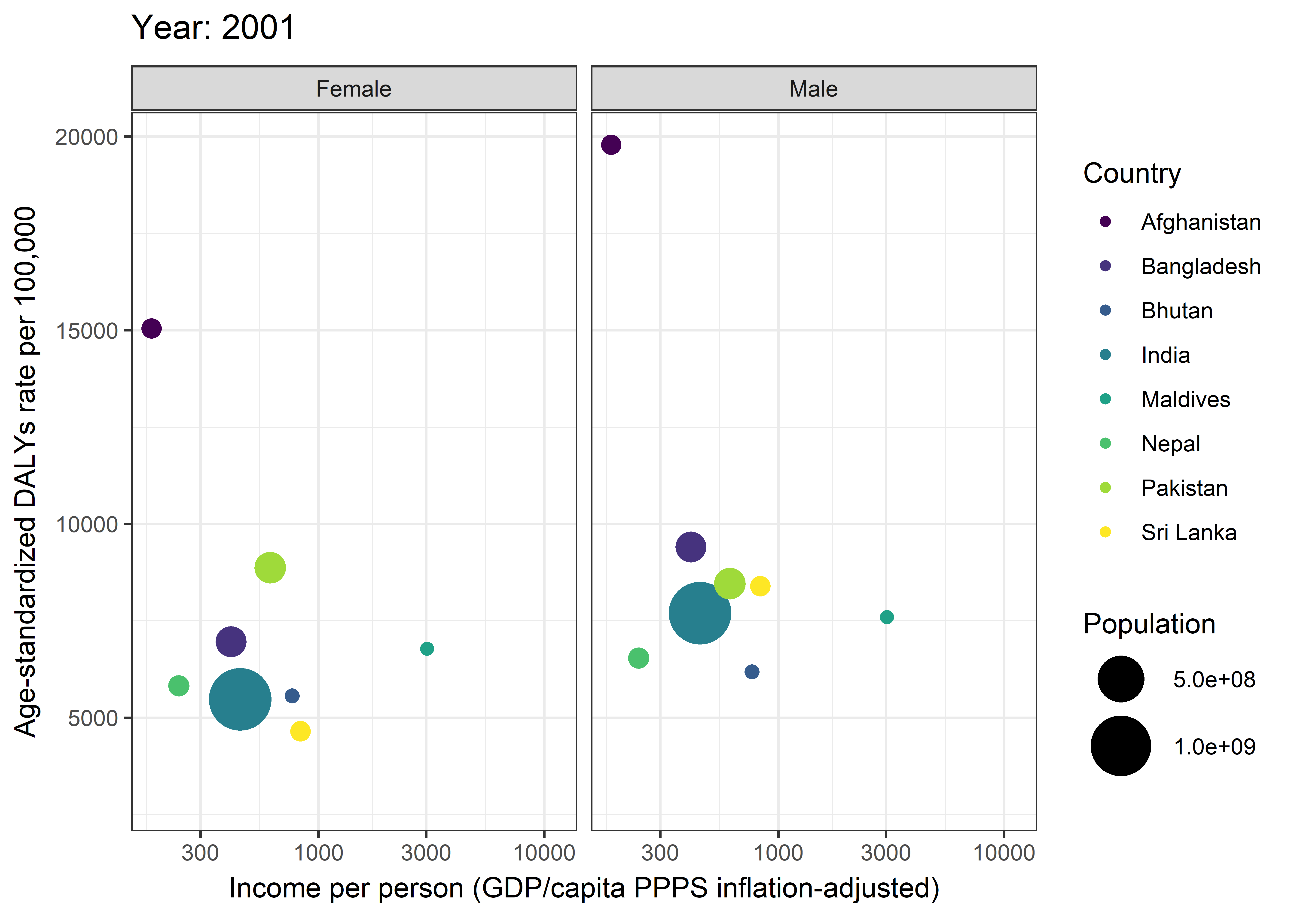
Code
#animate(R, height=400, width=800, renderer=gifski_renderer())Creating Maps and Mapping data with ggplot2
Note
The shape file for Nepal can be obtained from Government of Government of Nepal geoportalaland availability of human resource data from Open data Nepal.
Code
#Loading datasets

data <- st_read("~/GitHub/Profile/districts.shp")
Reading layer `districts' from data source
`C:\Users\drnip\OneDrive\Documents\GitHub\Profile\districts.shp'
using driver `ESRI Shapefile'
Simple feature collection with 77 features and 4 fields
Geometry type: POLYGON
Dimension: XY
Bounding box: xmin: 80.05847 ymin: 26.34776 xmax: 88.20155 ymax: 30.47297
Geodetic CRS: WGS 84Code
medical_doc <- read.csv("~/GitHub/Profile/medical_doc.csv")

#Preparing dataset

##Merging shape data with human resource data
df <- medical_doc %>% mutate(across(where(is.character), toupper))
dat <- merge(data, df, by="DISTRICT")

#Creating list of co-ordinates for adding district names in the map
points <- cbind(dat, st_coordinates(st_centroid(dat$geometry)))
Plotting map and mapping data
Code
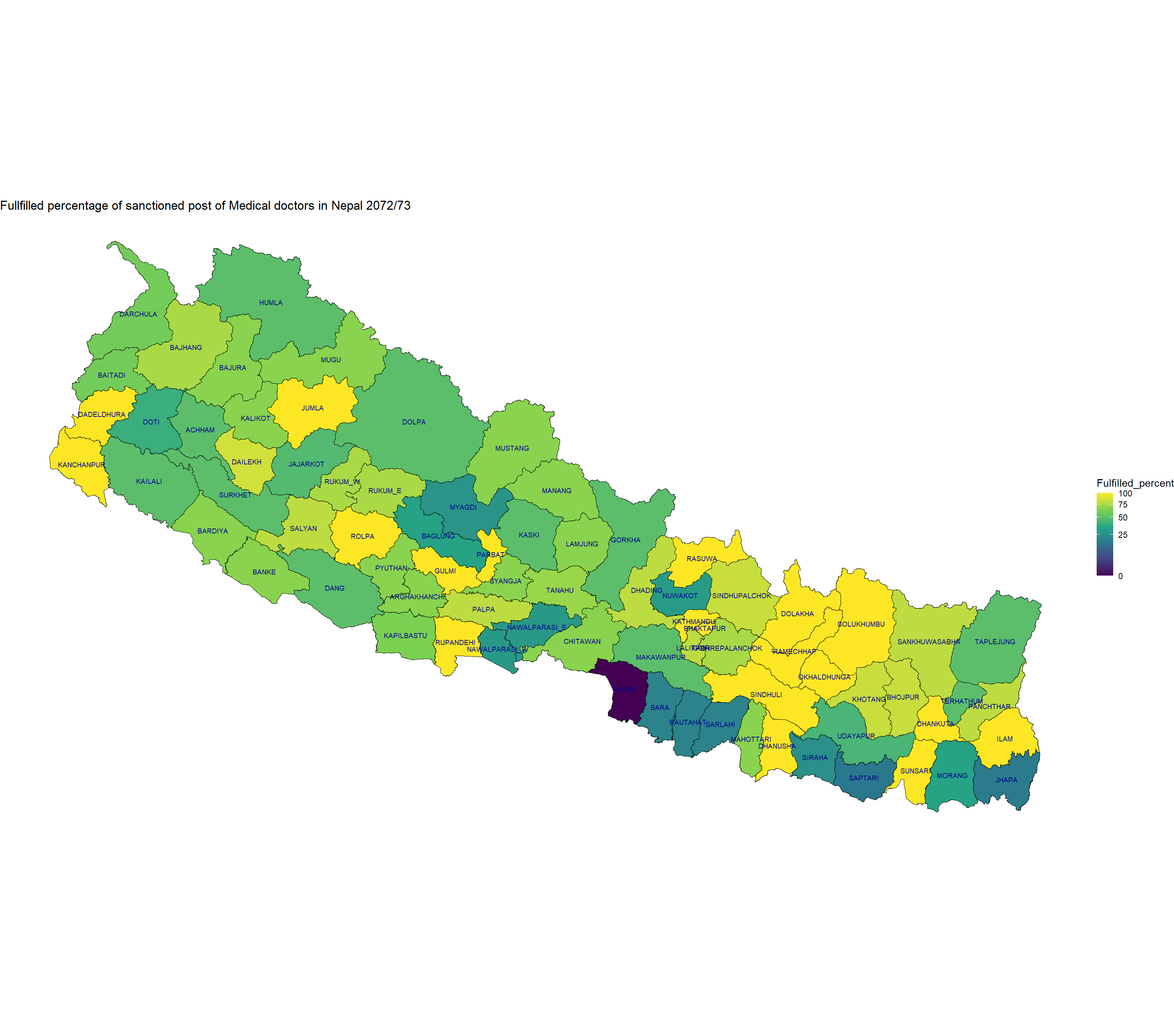
# Plotting data

ggplot(data=dat) +geom_sf (aes(fill=Fulfilled_percent), color="black", size=0.2) +
    scale_fill_viridis_c(option = "viridis", trans="sqrt")+
    geom_text(data=points, aes(x=X, y=Y, label= paste(DISTRICT)), color="darkblue", size = 2.5) +
    ggtitle("Fullfilled percentage of sanctioned post of Medical doctors in Nepal 2072/73") +
    theme_void()